Forum Index > News and Announcements > Lunemara Revamp Preview
Page 4
1, 2, 3, 4, 5... 13, 14, 15
Go to Page:
Author
Thread Post
Littlemissmoriarty
Level 75
Supernatural Shopaholic
Joined: 5/9/2015
Threads: 329
Posts: 2,510
Posted: 3/9/2017 at 9:55 PM
Post #31
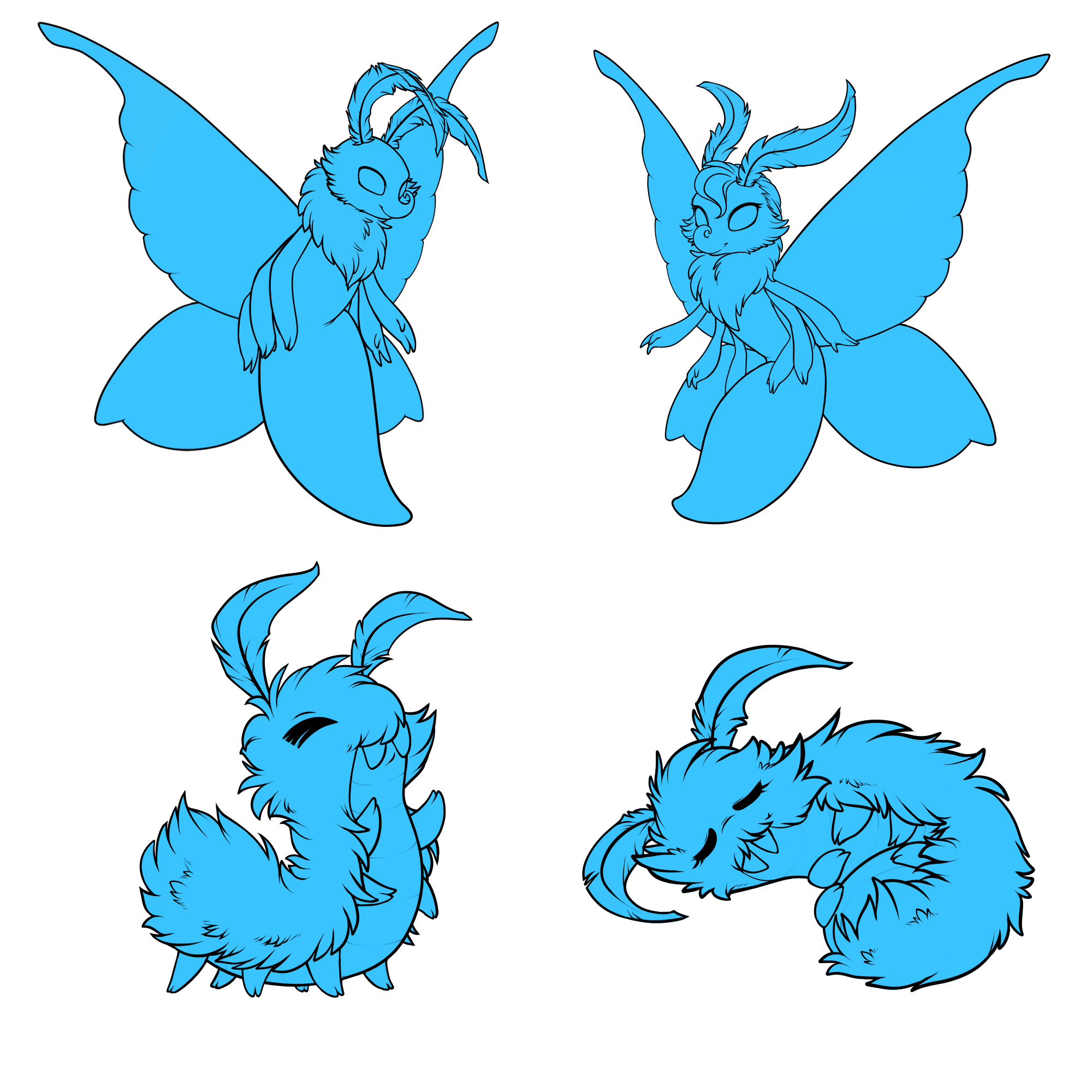
I actually like that fluff, its cute. The female adult looks definitely too bent. Do not like the male hatchling., I dont know, perhaps not enough lineart to really make it look like a lune to me. Will be keeping tabs on how these come about. They are kinda cute. Definitely like the wings. Very well done with the wings.
Jennysyc
Level 75
Warden of Umbra
Joined: 7/1/2016
Threads: 22
Posts: 757
Posted: 3/9/2017 at 9:55 PM
Post #32
I'm not really a fan of the lunes, and I have to agree the noses and arms of the adults don't look appealing to me. Perhaps if you incorporated the nose from the old design and made the arm joints more angular (implying segmented legs)? Just my two cents.
Xovinx
Level 74
Fright Master
Joined: 3/12/2014
Threads: 15
Posts: 388
Posted: 3/9/2017 at 10:01 PM
Post #33
Oh. My. Goodness.
I've never been a huge fan of the Lunemara, but I love these new designs! They're like little fairies now, little buggy fairies. ^^
The female does look a bit bent, but somehow I think that really fits and adds to her feminine look. :) Thanks for the sneak peek, Krin!
UpsidedownSarah
Level 61
The Tender
Joined: 11/29/2013
Threads: 92
Posts: 2,784
Posted: 3/9/2017 at 10:11 PM
Post #34
There are numerous problems with this update. The main one is that they are now entirely too humanoid for comfort, as others had said. I think the idea of breeding something this humanoid and selling it is pretty creepy to be honest. I know this may sound un-supportive or un-constructive, but I don't mean it that way at all. I hope if enough people tell you it is too humanoid, you will greatly revise the artwork with everyone's suggestions in mind so that this species will become more popular and an even more integral part of the game than it already is.
I think all my other points have already been mentioned. I just want to say two things: 1. If you want to get me to invest my time and money in these, this artwork will not do it. 2. The old, more "buggy" style artwork was better.
Xavion
Level 75
The Perfectionist
Joined: 10/15/2013
Threads: 434
Posts: 5,683
Posted: 3/9/2017 at 10:11 PM
Post #35
I'm definitely among those who just aren't feeling the noses. They look... Dr Seuss - ish.
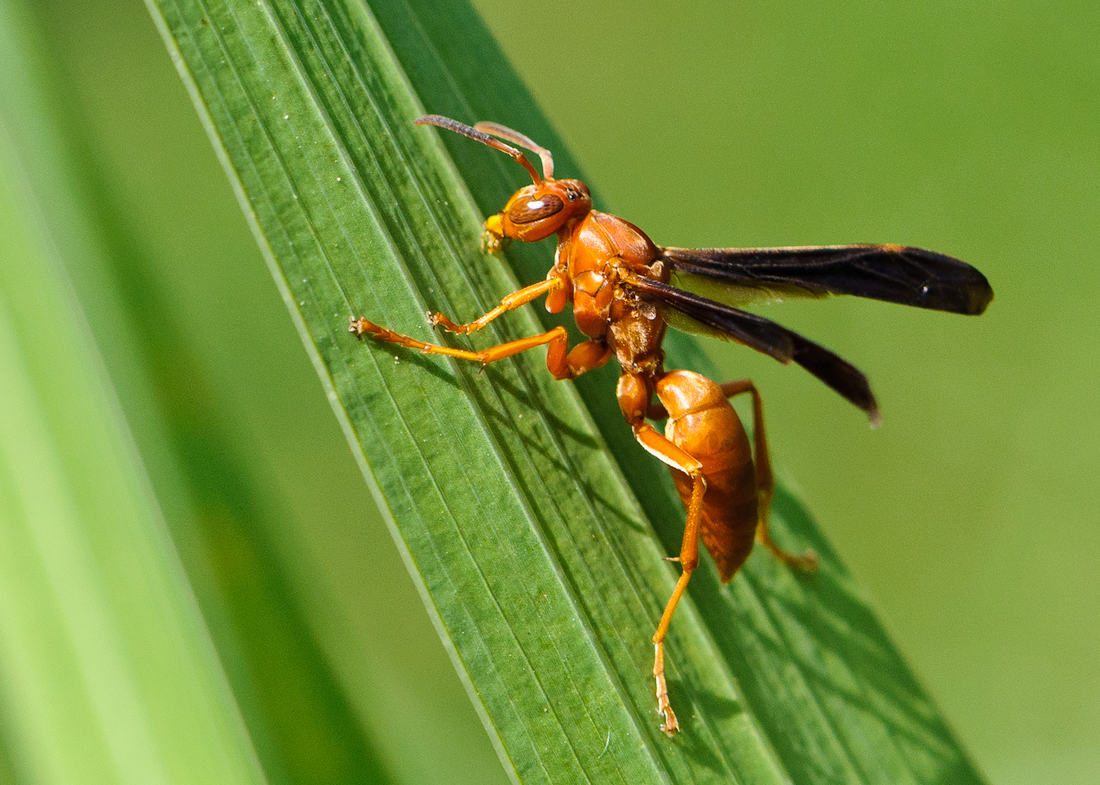
The bodies also look more like wasps than moths or butterflies... especially the female's since she has such a tiny 'waist' that bisects the parts of the body. And honestly, I don't like wasps. .__.;
The arms also look a little... large? Okay I'll put it more direct: the arms look too fat!! Some fluff detail on the edges would really balance them out if they're intended to keep the furry lunamoth look. As they are now they just look like weird six-armed alien things... The fingers are a nice touch overall since it makes them less buggy and more magical, but the smooth lines just make it look so out of place. The current Lunemara keeps the fuzziness from neck to toe which is something I've always loved about the fuzz-bugs.
One thing that also throws me off a little is the placement of all of the arms. On an actual flying insect, the lowest legs are usually designed to be... well, more like legs. Each pair is placed just a little lower than the last, and while the front four stay up towards the front or sides, the lowest two balance out the rear.
At the very least, some more space between the arms would make it look more... natural as opposed to stacking arm over arm over arm.
For a more positive comment since I really am thrilled to see this, the female looks more feminine! The swirly hair up top is adorables! :D (I just wish the nose wasn't that swirly. o_O; Looks like they could poke their own eyes with them schnozes!
Final comment... the female hatchlings look, ah... kinda dead. I know she's meant to be sleeping and overall, it's cute, but the flat expression makes it look like she curled up and died. .__. Maybe give her mouth area more of a smile like she's dreaming of becoming a beautiful adult one day? I've seen plenty of dead caterpillars in my time (poor things liked to drown in the local swimming pool :( ) and that... that looks pretty dead to me. .__.;
Lokiarti
Level 61
Joined: 2/21/2016
Threads: 107
Posts: 3,979
Posted: 3/9/2017 at 10:17 PM
Post #36
it's not the elbow, it's part of her body, it's... bent? not sure how it should be said. the elbow of that arm is not visible. ^^
The style of them seems very...old? in comparison to the other artwork on sylestia. It reminds me more of the old artwork (specifically the very original aurleon that looked like rubber chickens) and doesn't seem to stylistically fit the new stuff.
Something about the noses definitely feels off...idk what, but i think the female is the worst off in that case. I almost feel like the nose should roll downward? Or more slender/long.
They honestly don't really feel like bugs anymore. Or even moths. They look more like a furry wasp. The old lunes were kinda stout in appearance, these look more elongated and less "pudgy bug". It seems to be more towards anthro but that doesnt really seem to fit the style well at all. One fo their defining features were those bug eyes. It realy set them apart from the other species, and with this new art those are gone. There is nothing to sepearate these lunes from the nephini. These new ones just arent fluffy like the old ones.
Also, the females left arm is rell bothering me. the bottom one doesnt line up.
on the other arms, it looks like the elbow gets smaller, but on this arm it almost gets larger at the elbow?
For clarification, the back "elbow" (red line) is her back, not her elbow. From this angle, you can't see the bottom arm's elbow, though I can understand the confusion. The arms are separate pieces that can be moved around.
Squigles
Level 70
Fabled Green Thumb
Joined: 1/22/2015
Threads: 82
Posts: 661
Posted: 3/9/2017 at 10:18 PM
Post #38
The larvae are so cute and pretty
but....
and it's pretty negative
I'm not trying to be
but the adults look like a moth with the grinch's head screwed on
O-O really they do
i think reducing the curl of the nose and a smaller mouth smile would help get rid of the effect
because at first glance (the female especially) it seems like the face is a face very similar to a who (from whoville) with a button nose
possible that coloring it in could fix that too
and maybe slant the female's body like she's flying to the upper left corner
also I've noticed in scath's designs that there are things floating in between the antennae like a mini moon or something which i think would be a very nice mutation o.o
Edited By Squigles on 3/10/2017 at 6:11 PM.
Firegem1401
Level 70
The Kind-Hearted
Joined: 7/15/2016
Threads: 33
Posts: 1,623
Posted: 3/9/2017 at 10:18 PM
Post #39
They look really nice but I'm not really sure if I like how the nose curls and the third arm in the back of both is pretty hidden. It'd be cool if they had bracelets or something repeating on all their arms though and the sleeping female one is really cute may remove the line between the eyes... Ok and I agree with some other users they look a little bit too humanoid like an aracne (Half Spider/Human) but wasp/Butterfly like
Edited By Firegem1401 on 3/9/2017 at 10:24 PM.
SpaceElf1
Level 75
Ghost Writer
Joined: 9/17/2014
Threads: 718
Posts: 13,402
Posted: 3/9/2017 at 10:34 PM
Post #40
Several people have already expressed opinions that are like mine.
"please make them more buglike"; "I do not feel anthro really can fit into the Sylestia artwork style after seeing this...It is just incredibly jarringly different"; "look really cartoonish...not matching how the other species look"; "I would perfer them (faces) to be more like bugs"; "The only problem is that it looks less like a bug and a sylesti and more like a cartoon/disney character so maybe make it more bug like and less cartoony"; "They're too humanoid for my liking. I'd prefer if they retained more of their insect features"; "make them more bug-like and less humanoid looking?"
"I also kind of feel like the faces could simply end with a cute little point instead of having a proper nose and mouth." I totally, completely concur with this!
"The "hands" are a bit much. Since they are supposed to be legs, making them all look like arms just looks... off. Perhaps the top set of limbs could be arms and the bottom two could be legs."
"...the female's body looks a little... broken in the middle? Maybe little bit less sharp an angle between the abdomen and the thorax?"
"Thank you so much for keeping the cuddly larva design"; "The hatchlings are super cute though! Although, maybe open eyes on the female"
"maybe the wings could be a little bit bigger like they are now";
You get the idea; I don't have to quote everyone. Oh, I would also like to see round insect eyes--to me, that was always one of the best Lunemara features.
In short, my (hopefully constructive) suggestion is "Less of A Bug's Life/Antz and more of Mothra."
Please note that I don't want anyone, especially the artists, to feel unappreciated due to my comments. Quite the contrary!
Also, here is a non-artist's attempt at drawing a possible version of the male Lune's face. Hopefully it still looks like a bug but is more personable than the current version.
Edit: OK, I am not too bright. I just now realized the curly noses are supposed to reminiscent of a butterfly's rolled-up tube mouth!
Well, why shouldn't a Lunemara have a butterfly-style mouth? They aren't moths, after all; they are Lunemaras. So non-artist me did this--
Perhaps an artistic person could modify the mouth so it appears at the proper angle to the rest of the head and also suggests a smile?
Edited By SpaceElf1 on 3/9/2017 at 11:29 PM.
Go to Page:
1, 2, 3, 4, 5... 13, 14, 15
Confirm Action
Are you sure you wish to delete this post?
Confirm Action
Are you sure you wish to restore this post?
Confirm Action
Are you sure you wish to report this post?
Go to Top
This Page loaded in 0.013 seconds.
Terms of Service | Privacy Policy | Contact Us | Credits | Job Opportunities