Forum Index > Groups, Guilds, Clubs, and Services > ~*~ DESIGNERS' CHALLENGE UNIVERSITY...
Page 132
1, 2, 3... 131, 132, 133... 348, 349, 350
Go to Page:
Author
Thread Post
Vanikmal
Level 71
Trickster
Joined: 2/11/2017
Threads: 65
Posts: 1,146
Posted: 12/8/2019 at 10:23 PM
Post #1311
Forgot to ping who I critiqued.
Sairento
Level 75
High Priest
Joined: 8/24/2018
Threads: 164
Posts: 7,943
Posted: 12/8/2019 at 11:20 PM
Post #1312
Diet Coke[Cherry]
So uh.. I don't drink coke...
But anyways...
Critiqued
Critique
Ok, I quite like this design, the colours all fit together very well, to create a nice, warm and maybe even tropical vibe. However, I feel it needs some tweaks. One of the major tweaks would be the added white. I felt you didn't have enough white in your design, unlike the image you used. As well as the added white, I made a few colours lighter for contrast.
I love this design a lot. The greens, reds, whites and grays go together really well[And they usually don't]. You've followed the reference picture really nicely, the ratio of colours extremely similar to each other. The one problem, however, Is that you used the same colour, but different shades. As in, the colour bar on the side stayed the same, you only made it darker or lighter. I think you should change that a bit.
Just to clarify, what I mean is you should make some shades of, green lets say, yellower, or more aqua. If they all are just green and dark green, it looks a bit drab, and usually doesnt really look good.
Before / After
Edited By Sairento on 12/12/2019 at 2:27 PM.
Chills
Level 67
Fancy Pants
Joined: 11/2/2016
Threads: 190
Posts: 4,494
Posted: 12/9/2019 at 12:21 AM
Post #1313
Meet CocaCola Bear Ryo
Critiqued~
I kind of aimed the genes to shade the fur, but I like the red on the fur almost like the scarf it reflecting a bit. I added a new gene and made that a very light redish pink (FFA8A8) so it didint really pop and plus a polar bears fur isnt really red, and I really based it off the animated bear but i like how the pink makes the whites pop more :).
This is the only pic that would work on imgur :p
~~~
*~*Critique*~*
Now Sairento I love the design, the mix with the light pink and purple pink look very nice. But maybe (using my mind of designing) You could use the same shade of pink. due to the light pink isnt really on the picture.
to Also sorry for the "now" I sound like a mom!
Edited By Chills on 12/11/2019 at 2:05 PM.
Celticnuru
Level 70
The Kind-Hearted
Joined: 12/17/2017
Threads: 244
Posts: 4,998
Posted: 12/9/2019 at 8:17 AM
Post #1314
Good Morning Everyone!!! I hope your day has started off nicely, and that you have an excellent start to your morning. The reason I PINGed you today, is that I wanted to introduce a holiday themed game to everyone that I hope will become an annual success. And no participation is not required, but you may very well want to do so. How it works will be listed below.
That's right, "Secret Santa". It is the holiday season themed gifting giving type of game. The game is played where everyone is assigned one person that they must get a gift for. Remember this is a SECRET!!! You can't tell anyone whom nor what you are gifting until December 25th!
The only exception to this rule will be me, since I will be the one handing out the names including my own. However, when I give you a name it will also be with a list of items that that person you are a "Secret Santa" for would like to have. If you are unable to get them an item from their list of desires, please be extremely thoughtful with your present. Don't give something you wouldn't want yourself to receive. So no undesirables like dishwater pets, common things like flowers, vines...etc, unless requested. If you need help achieving a gift, please let me Santa's head elf know so I can hopefully see if I can assist you with your gifting.
If you are interested in participating, please PM me the form below privately!!!! That way I have your secret wish lists hidden from view until it is time to hand out. If you do join in on the fun, you will be given a name on the 20th with a list and set of instructions. You can reveal your information to your given individual on the 25th if you wish to. You have until the 30th to complete your Secret Santa(ing). If you participate and don't receive a gift by that date, please let me know promptly.
Sign-Up Form:
(Remember to send this form back to me privately!!)
Username:
ID:
Wishlist (Please give a minimum of 3 things to a max of 10 things you wouldn't mind having given to you):
Favorite/Least Favourite Color(s):
Favorite/Least Favorite Specie(s):
Can you hold/house anymore pets?:
Those Whom Have Entered: (08/14)
Celtic
Koterfaye
Akirashadowwolf
Spiritbeast
picklethedarklord
Limor
Sairento
Chills
Edited By Celticnuru on 12/13/2019 at 9:00 AM.
Celticnuru
Level 70
The Kind-Hearted
Joined: 12/17/2017
Threads: 244
Posts: 4,998
Posted: 12/9/2019 at 8:19 AM
Post #1315
I will be doing updates tomorrow for this week's challenge, which includes putting up a "Entries Thus Far" post.
Edited By Celticnuru on 12/15/2019 at 5:19 PM.
Danithegoat
Level 72
The Sweet Tooth
Joined: 2/2/2019
Threads: 45
Posts: 1,440
Posted: 12/9/2019 at 10:13 AM
Post #1316
Coca Cola Light
Gonna be honest, I prefer Pepsi.
Critique Edit:
The blue part wasn't supposed to be there, oops. I added the new traits (phoenix crest and tempest runes) and made the red brighter and bolder. I'm personally a fan of duller colors but the bright and bold colors work in this situation. The phoenix crest reminds me of the fizz you get if you pour soda in a glass too quickly.
Critique for Chills
I find this design really cute! I like how you didn't use a morkko for this design, I never would have thought to use a ryo. The spring blossom trait works really well as ice and snow, and adds to the wintery feel of the design. The shading makes the body look more fluffy, which works really well with the cute polar bear design.
So the only thing I noticed was how it looked a little whiter than the reference image. I tinted the fur to make it a little more orange-yellow, which matched the colors pretty well. If you look at images of polar bears, they aren't always completely white. You can try adding a yellow-orange tint to the fur (C1,C3) to make it looks a little less pale.
--->
Edited By Spiritbeast on 12/13/2019 at 8:59 AM.
Danithegoat
Level 72
The Sweet Tooth
Joined: 2/2/2019
Threads: 45
Posts: 1,440
Posted: 12/9/2019 at 10:14 AM
Post #1317
Forgot to ping, sorry, Above post is mine
Edited By Spiritbeast on 12/9/2019 at 10:14 AM.
Akirashadowwolf
Level 54
Snow Wars Combatant
Joined: 10/2/2018
Threads: 39
Posts: 933
Posted: 12/9/2019 at 10:20 AM
Post #1318
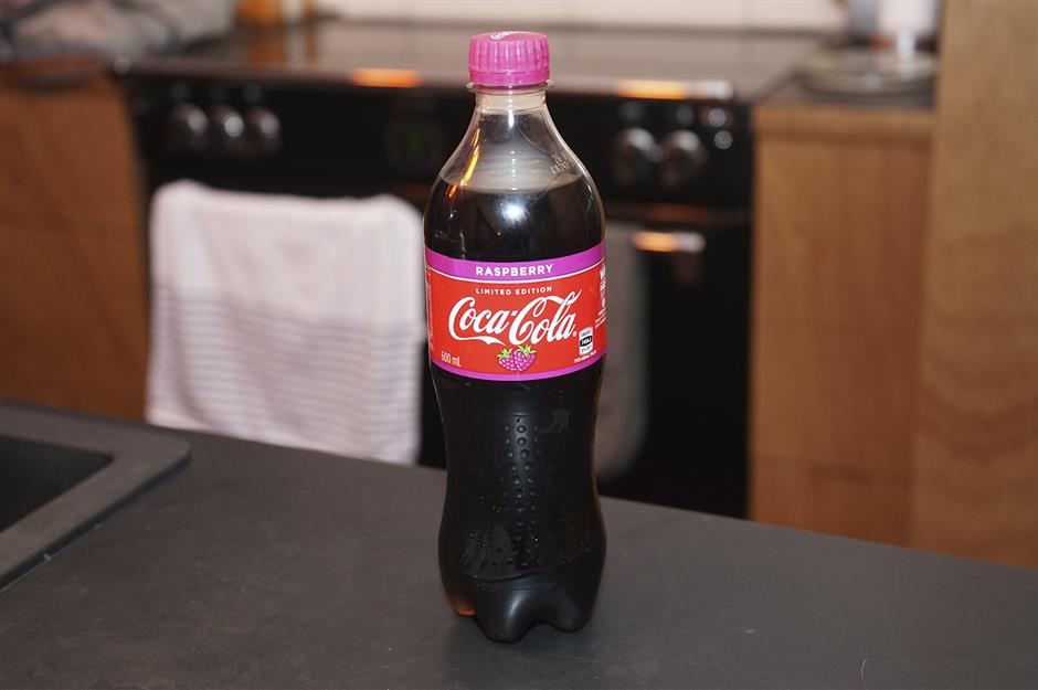
So the irony is I was actually drinking a glass of coke while reading this and I live in the state that coke actually originated in! Just thought that was kinda cool.
So this flavor was only released in New Zealand but I got to try it and it is AMAZING!
Edit Critique
I actually really liked this design and I respect the struggle behind it as I know the simplicity of the logo can make things difficult. The main differences I made was that I added Phoenix Crest in M3 as well as changing the hue of the blue to get closer to the grey scale area without being totally grey (if that makes any sense). I also added Tempest Runes to G3 and made the color a bit closer to red while still separating the color from the other reds as it seemed a bit too purple in my opinion. I also adjusted C3 to make the colors a bit bolder. I still absolutely love your design and I cant wait to see more from you!
vs
Edited By Akirashadowwolf on 12/9/2019 at 7:10 PM.
Celticnuru
Level 70
The Kind-Hearted
Joined: 12/17/2017
Threads: 244
Posts: 4,998
Posted: 12/9/2019 at 11:31 AM
Post #1319
Remember hon to post your responses to your critiquer after your altered piece. The altered piece needs to be next to the orignal for comparison. I understand that the critique may not have been helpful to you, but you at least tried. And that is what counts.
Also with your critique to the other designed that you critiqued for, you need to specifically state what worked well so they know for future reference. You stated specifically what needed to change and that was great!!!
Celticnuru
Level 70
The Kind-Hearted
Joined: 12/17/2017
Threads: 244
Posts: 4,998
Posted: 12/9/2019 at 11:35 AM
Post #1320
I see what you were saying in your critique, however I can also see how it was confusing. Could you please be a bit more specific?
Also, your reference picture for your critique shows no real changes at all. Could you please make your show piece to what your are referring to stand out a bit more? Maybe change a color, gene, or mutation?
Go to Page:
1, 2, 3... 131, 132, 133... 348, 349, 350
Confirm Action
Are you sure you wish to delete this post?
Confirm Action
Are you sure you wish to restore this post?
Confirm Action
Are you sure you wish to report this post?
Go to Top
This Page loaded in 0.028 seconds.
Terms of Service | Privacy Policy | Contact Us | Credits | Job Opportunities