Forum Index > Pet Sharing and Design Discussion > Summer Fest Theme Submissions
Page 1
1, 2
Go to Page:
Author
Thread Post
Typicalannamarie
Level 75
Guardian of the Realm
Joined: 12/26/2021
Threads: 18
Posts: 232
Posted: 6/14/2022 at 12:49 PM
Post #1
Summer Fest Theme Design Submissions
I thought people might like a place to discuss their theme submissions and receive feedback.
If this already exists, please share the link below.
Share your theme submissions, comment constructive criticism or praise, but please be kind. :D
Edited By Typicalannamarie on 6/14/2022 at 12:49 PM.
Typicalannamarie
Level 75
Guardian of the Realm
Joined: 12/26/2021
Threads: 18
Posts: 232
Posted: 6/14/2022 at 12:51 PM
Post #2
Here are mine:
Pineapple Aeridini
Summer Tanager Aurleon reworked
FroYo Bulbori
Painted Bunting Draeyl
Deep Forest Faelora
Watermelon Ferrikki
Kestrel Griffi
Fiery Seas Kelpari
Mint Tea Lighira reworked
Toasted Marshmallow Luffox reworked
Flamingo Float Lunemara
Beach Ball Lupora
Hot Balloon Morkko
Rainbow Sprinkles Nephini
Soap Bubble Ny'vene
Solar Flare Nytekrie
Poison Dart Frog Puffadore redone
Thing 1 Qitari
Little Mischief (Rose) Ryori mild rework on colours not sure if I like the name with or without "Rose" but the design is based on the Little Mischief Rose
Coral Reef Sylvorpa
Strawberry Vulnyx
Cherry Blossom Zolnixi
Edited By Typicalannamarie on 6/22/2022 at 1:09 PM.
CeruleanCrow
Level 75
High Warlord
Joined: 2/23/2017
Threads: 86
Posts: 1,752
Posted: 6/14/2022 at 2:11 PM
Post #3
lh/ g/ This is a "hoo boy" moment for me, let's get this unpacked.
Some general advice that applies to the entire board:
1. Reference Images! Lot's and lots of reference images. Overall most of your designs have maybe 3-7 different colors, some of them repeating more than four times. As an example here, if you look up a pineapple on Google you'll find that there's a lot more than just one shade of green or yellow on it. A time old trick I learned from my design mentor on here is to take a reference image and work with it instead of just looking at it.
2. Your names are a little too on the nose. Nothing wrong about that, and this is a bit more personal style, but try putting some variation on your names. Word Association sites and Thesaurus are your friends. Again with the Pineapple Aeri, try instead maybe "Pineapple Slice" or "Pineapple Plant". It adds a bit more depth into the theme. You can also go more eccentric for some, get creative with names! I do like the Fiery Sea Kelpari's name!
3. Addressing the biggest elephant in this room for all of of the designs, there's a lot of repeating colors here. It get's boring looking at the same greens or blues or even pinks all the time. Try to put some variation between colors. Make them darker, duller, brighter, put contrast between shades and tones. Not everything has to be a super saturated orange or blue all the time. A good neutral color will help balance everything out.
As an example I decided to rework your Pineapple Aeridini
Old vs New
Reference
Notice how the image of this pineapple is way more bright and less saturated, the lighter "green" colors lean more desaturated yellow in the light while the shades are more green. The husk is way more brown than people give it credit for as well. Brown as the neutral color, with lighter yellows and darker greens. The design looks less monotone and repetitive and utilizes different shades and colors from the spectrum. Don't Limit yourself to just one area of the color wheel!
Lastly of course you can find inspiration anywhere. Sometimes I use abstract wallpapers to make themes! Stretch your horizons!
I hope you found this helpful, don't be afraid to DM me if you want advice on designs though I may not get to all of them at once.
- Crow
P.s. you can use my pineapple redesign for inspiration, but not as your own entry thanks youuu/lh /g
Typicalannamarie
Level 75
Guardian of the Realm
Joined: 12/26/2021
Threads: 18
Posts: 232
Posted: 6/14/2022 at 2:24 PM
Post #4
I think this is an agree to disagree type of situation.
I went more saturated and bright because that felt more summery to me, but I appreciate your feedback.
Thank you. :D
((I did, however go through and try to use colours that aren't overused for each species, and the general advice makes sense broadly. I use reference photos, as well.))
Edited By Typicalannamarie on 6/14/2022 at 2:28 PM.
Kivoichi
Level 75
Champion
Joined: 10/2/2021
Threads: 54
Posts: 983
Posted: 6/17/2022 at 11:29 PM
Post #5
I would agree that although bright colors are, well, summer-y, making all of them very bright makes the colors contrast a bit too much. Perhaps bring some base colors to more neutral, softer colors? However, do all you feel is cool. Your style is pretty shiny haha.
Here's some designs that I slapped on last-minute hohoho. Please don't mention the last two, because, well..yeah. xD Criticism and name suggestions would be..awesome!
Icy Lemonade Ferrikki
Cockcrow Beach Ny'vene
Mystic Dawn/Strawberry Mint Puffadore
Simple Orange Ryori
Aurora's Savior Nephini
Jellyfish Summer Lighira
Red Bellflower Lupora
Beachy Tide Aeridini
Sundaze Blaze Bulbori
Breezy Delight Lunemara
Edited By Kivoichi on 6/20/2022 at 10:43 AM.
Eternalsilver
Level 75
Wondrous Witch
Joined: 2/16/2021
Threads: 21
Posts: 958
Posted: 6/19/2022 at 2:36 PM
Post #6
Critique would be much appreciated, name suggestions as well (since English = anguish) - even if the design already has a name. Please ping me :)
Typicalannamarie i think your colour choices are amazing i can defiently see some that i would be striving to get my hands on if they get chosen they remind me of lot of summer thing i've seen like beach towels and sand toys or popsicles with their bright colours and they look amazing; i adore you Soap bubble Ny'vene pallets they look gorgoues
Eternalsilver i've seen your designs! ironically i'm right under you on the contest fourm so i was seeing them every time i went to edit my post to add a new design when i finished one, and i've got to be honest every time i had to stop and just admire Faelora and Ferrikki pallets they are just so gorgoues i think the colours just mix together and just give me such a boost looking at them, and your Ny'vene pallet is also beautiful.
as for names perhaps something Sunrise and flower like for your Griffi, it's likely not to work but the name "yatch/beach party' entered my mind as soon as i looked at your lightra, the bright colours on the darker blue background remind me of images of parties and with the dark blue background remind me of an event with a water background simiarly with your qitari you could use soemthing like Ocean Dawn or the like with the mix of orange over blue like a sunrise on water
i've spend almost every summer of my life visitng relatives in a small town so other then going to the lake nearby i didn't go places a lot so most of my designs are water based or flower/plant based, but i love desining things and had fun creating colour pallets without having them be too similar for the summers themed, i also didn't have an easy time with the names and think about half of them are pretty basic so if anyone has any suggestions i'd love to hear them
Marigold Aeridini
Water balloon Aurleon
Lilac Bulbori
Forest Creek Draeyl
Ancient Forest Faelora
Warm Sunset Ferrikki
[i[bDogbane leaf beetle Griffi
Sunflower kelpari
Scavenged Sea Glass Lightra
Monarch butterfly Luffox
Pink lemonade Lunemara
Bonfire Lupora
Strawberry Slushy/Overgrown Strawberry Morrkko
Unsure of the name but its defiently cold Treat or wild strawberry themed
Smore nephini
Beach Ball Nyvene
Ocean shipwreck Nytekrie
Fire Starter Puffadore
Fruit punch Qitari
Fudge-sicle Ryori
Lake algae Sulvorpa
Mint Chocolate Chip Vulnyx
Coral Reef Zolnixi
Eternalsilver
Level 75
Wondrous Witch
Joined: 2/16/2021
Threads: 21
Posts: 958
Posted: 6/20/2022 at 8:36 AM
Post #8
Aw, thank you! Interestingly enough, the faelora color palette is actually from a wild pet, with a few color adjustments, of course. The ferriki and ny'vene were a little bit experimental, but I'm happy with how the two of them turned out.
Thank you for the name suggestions! I'll have to go hunting for names later, but I'll keep yours in mind :) Just wanted to say that your qitari design is very pretty, it reminds me of a summer carnival/festival, and your nixi design is gorgeous as well! However, if I might suggest some adjustments:
my adjustments:
original design:
Remember, you can vary the amount of visibles the design has - not all of them have to be 6-vis. Sometimes I make the male 3-vis and the female 6-vis, or vice versa. Other times, I make both of them 3-vis so that they cover all the slots. It's good to demonstrate flexibility with your theme, since normal tagged pets can't be 6-vis. By doing this, you're proving that your theme can look good with any amount of traits! Another tip is to do the unexpected - as in, if you're struggling to make some colors work, maybe try a different color altogether. If you use reference images, pull up another image of the same thing and work with those colors as well!
I chose another of your designs to look at - your Marigold Aeridini. It has lots of potential, but right now, I think it needs more colors besides shades of yellow.
original design:
In G1, the color you chose is total black - #000000. While there's nothing inherently wrong with this, if it gets chosen as a theme, the color swing could have a nasty effect. So instead of complete darkness, maybe change it to a dark yellow or a dark green.
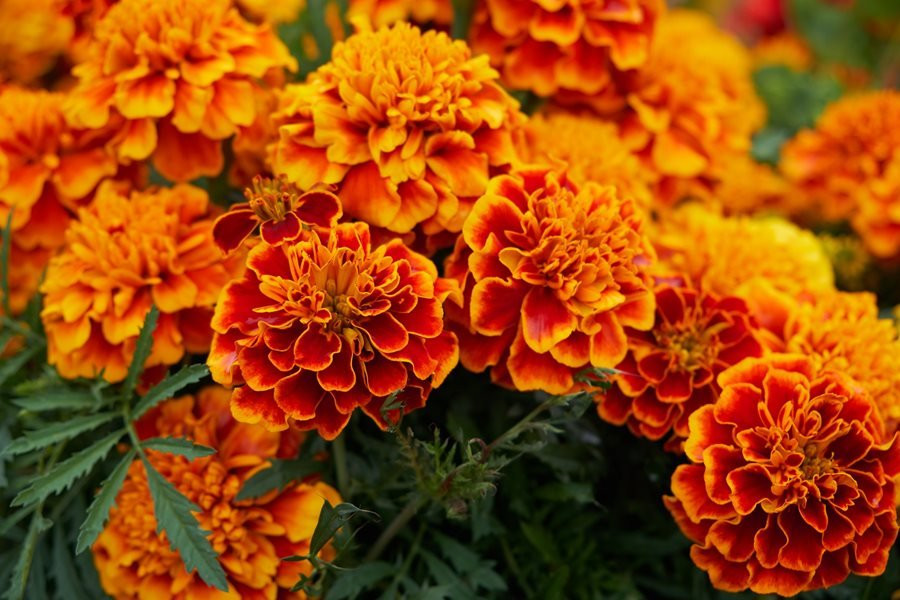
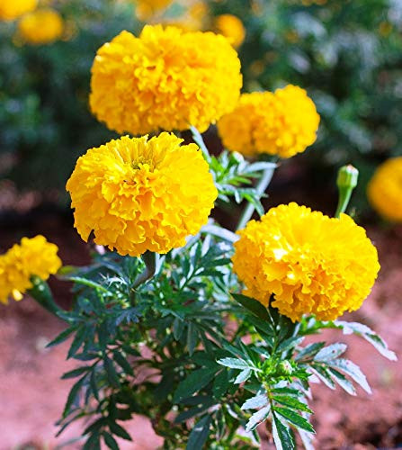
Let's look at a few reference images of marigolds (thanks, google):
As you can see, marigolds aren't just yellow - they can be orange, too! You can even incorporate some green, from the stem, or a dark coral from the soil. For getting colors, I use a color from image picker, but you could even eyeball it if you want!
After adding some light reds/pinks, bright yellows, and soothing greens, your Marigold Aeridini became this:
It has many more colors now! Feel free to update your design and model it after my adjustments, but please don't feel forced to! I'm not the most experienced designer on Sylestia, and they are your designs, so do whatever the heck you want with them :) After all suggestions are just that - suggestions. I do hope this helped though, and I apologize for the utter size of this post. I actually did not mean for it to get this large >.>
Typicalannamarie
Level 75
Guardian of the Realm
Joined: 12/26/2021
Threads: 18
Posts: 232
Posted: 6/20/2022 at 8:43 AM
Post #9
I love your Rikki and your Ryori!!
The Neph is nice, as well!
I get what you mean about the base colours.
People seem to either love or hate the saturation with little in between (but that makes it kinda fun ;-D ).
Edited By Typicalannamarie on 6/20/2022 at 8:47 AM.
Infitlizards
Level 73
The Perfectionist
Joined: 5/12/2022
Threads: 22
Posts: 318
Posted: 6/20/2022 at 9:06 AM
Post #10
Thankyou, I have to agree with you the palettes look a whole lot better after adjusting the colours and the redid aerdini looks gorgeous all of your tips and idea are very useful so Ill probably be going back over some of my designs Im not content with espically my aerdini, it was the first one Id made and Id not bothered to look at any references and just sort of tried to make the yellows look good together lol, so Ive have to mess around and see if I can find a better mix with colours that Im more content with, thankyou (^-^)
Go to Page:
1, 2
Confirm Action
Are you sure you wish to delete this post?
Confirm Action
Are you sure you wish to restore this post?
Confirm Action
Are you sure you wish to report this post?
Go to Top
This Page loaded in 0.019 seconds.
Terms of Service | Privacy Policy | Contact Us | Credits | Job Opportunities