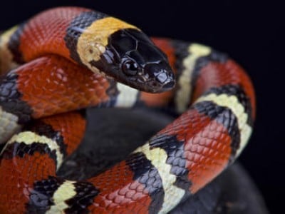
Milk Snake is one of those "love it or hate it" traits with a lot more hatred than love. It's also pretty inaccurate for its namesake as it greatly oversimplifies the pattern. Rather than perfectly smooth transitioning colors for every single stripe like the Ny'vene displays, a milk snake's scales add some dynamic patterning..
Rarely do you get a patch of smooth transition like the Ny'vene's entire gene.
So for a suggestion... offset those lines. They're too "clean" and it just looks ridiculous. Great if you're making a jester or something that intentionally uses the trait in such a way, which I have, but beyond that it's often a scourge of woe and dismay - especially on themed pets. Offsetting the lines would make it feel more "natural" and less "cartoony."
I'm definitely not an artist so I can't draw it, but throwing in some scale tips like this lovely serpent here would likely take it over the top and turn it from "woe" to "whoa."
Edited By Xavion on 1/21/2019 at 6:44 PM.
Confirm Action
Are you sure you wish to delete this post?
Confirm Action
Are you sure you wish to restore this post?
Confirm Action
Are you sure you wish to report this post?
Go to Top
This Page loaded in 0.006 seconds.
Terms of Service | Privacy Policy | Contact Us | Credits | Job Opportunities