Do you guys have any advice for what should be fixed, chaned ect. for this pony? Or do you think it looks fine?
IvyCat
Level 62
Trickster
Joined: 8/23/2016
Threads: 106
Posts: 23,715
Posted: 10/30/2018 at 5:10 AM
Post #2
I'm guessing canter?
The front wither looks a bit too flat and thin near the top to me, and the back legs also look a bit off and flat, the further away one especially, maybe try adding a bit more curve to the bottom part of it. It depends what horse breed you're drawing, but for the head the muzzle needs to be more domed for most horses and the ears a tad bit bigger.
Edited By IvyCat on 11/3/2018 at 4:32 AM.
Electrifying
Level 70
The Tender
Joined: 11/15/2013
Threads: 28
Posts: 1,665
Posted: 11/3/2018 at 12:31 AM
Post #3
I'm going all-nuclear on this, but I have to say I am impressed with the muscles and shape of the overall horse - I am sure you used a reference, and it shows!
Unless you draw horses every hour, using a reference is a great thing for your work. I also used a few pictures over this critique. :P
Its hard to tell because your angle is a little slanted, but the hooves look a tad big.
Also the legs are too long in the picture.
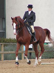
Here's an image of a horse:
The two red lines are the exact same length, so the body and leg height are around the same.
This is your picture:
So yeah, I'm sure the legs are too long. I think part of the problem is due to the angle of the photo though! If the legs and body are the same height in the picture, then disregard this!
Head:
Cheeks need to be fuller, eyes are a little low.
Other:
I think the back could do with being a tad longer too.
Also, in just about every cantering horse in the top images in Google shows the back leg (furthest from us) bent, so I put that in. I don't know about your ref though!
In my drawing the back leg closest to us is in a weird angle, could do with being in line with the stretched front leg. I can't be bothered for a redraw though!
Another tip: I find I get used to a drawing after a while, and flipping it help me gain a fresh perspective. Since yours is traditional, perhaps flip it around and put it up to a light to see the mirror image.
A lot of the times I go from "This looks okay" ---------> "EWWWWWW" after flipping an image.
Does this image looks the same, or weirder to you?
Edited By Electrifying on 11/3/2018 at 12:35 AM.
Taptothebeat
Level 72
Cutely Creative
Joined: 1/12/2013
Threads: 212
Posts: 3,658
Posted: 11/9/2018 at 9:53 PM
Post #4
Idk if I'm adding anything, since the two poster's above gave great feedback.
Looks great overall! And I like your shading. :)
The most prominent thing I noticed is that the horse could use a belly. Even a pretty in shape horse will have some fat. The bottom of the horse should shape lower in the front and higher in the back.
Keep at it! Horses are super tough to draw ;;
Confirm Action
Are you sure you wish to delete this post?
Confirm Action
Are you sure you wish to restore this post?
Confirm Action
Are you sure you wish to report this post?
Go to Top
This Page loaded in 0.009 seconds.
Terms of Service | Privacy Policy | Contact Us | Credits | Job Opportunities