You have a lot of good designs, the ideas are solid and the colours make sense for the idea.
Some of the colours seem a little bold or bright while others are a little dark. You need a decent balance of both, making sure the colours arent too bright or dark.
I noticed you use a lot of bright and vibrant colours, which isnt a bad thing, but by combining them with darker, paler colours, it gives the design a mismatched feel. Bright and vibrant colours work well with certain designs, but when you want to make a design based on ice or snow, bright vibrant blues dont work as well as pale blues and greys.
Ive made edits and changes to some of the designs and pointed out both what you did well, and things to improve upon.
Original vs my edit:
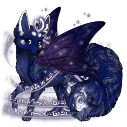 
The design is really pretty, the darks look nice but arent too dark, the traits fit well with the colours and the overall design doesnt feel overcrowded. I made the colours a little paler, and added valentines lace to the design, this balanced out the lightness found in the magic spell trait and gives the design more variety.
Original vs edit
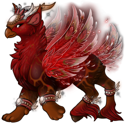 
The colours on this one are beautiful, a lovely mixture of light and dark, vibrant and muted. Because of this, I didnt need to change much other than add a bit of orange and yellow as well as change 3 of the traits. The wings you had picked, the wing patterns didnt show up so I changed them to something else, while still keeping the fire aesthetic. I changed the tail to make it look more like a fallen log, and finally the leaf veins, my least favourite trait. It has so much potential but the way its layered just rubs me the wrong way. I changed it to the peacock one instead as it didnt cover as much and it still gave the same effect. Overall, this design you made is very pretty and there wasnt much to improve upon other than adding a bit of golden orange and being aware of how traits mesh.
Original vs edit:
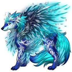 
Your design immediately reminded me of ice caves, theyre a bright and vibrant blue, which suites the colours you picked. I darkened the blue in the main fur and then muted some of the other colours to give it a less in your face feel. I also changed frosting to frosted glass, as it incorporates more colours and has more of an icy appearance.
Basically you have a lot of talent and potential. My biggest pieces of advice are add more colours, dont keep it a solid block of colour. Use reference images to help with colour selection, and dont go too bright and vibrant with colours (also try to steer clear of pure whites and blacks)
Im happy to help with any designs and give advice if you need it :) |

