Forum Index > Groups, Guilds, Clubs, and Services > ~*~ DESIGNERS' CHALLENGE UNIVERSITY...
Page 65
1, 2, 3... 64, 65, 66... 68, 69, 70
Go to Page:
Author
Thread Post
Vampory
Level 75
The Carver
Joined: 3/31/2017
Threads: 47
Posts: 2,992
Posted: 1/26/2022 at 7:03 PM
Post #641
Album: evil twin - Isaac Dunbar
Fan Behavior (^Spotify Link if you want to listen to the specific song I'm obsessed with ^) After Critique Edit:
I wanted to do something I wouldn't normally do, which is work with two color-color palette. I almost picked a different album cover just so it'd be easier, but I decided not to.
Critique for Hiraeth:
before after i got my hands on it lol
If you know me, you know I love my saturation lol. It was lacking the tints of blue on the water, so i made the g1 teal and added it. the g2 i changed pink so you could see it better. I basically ended up switching the g3 and c3 slot so Magma runes popped a lot more. Overall I just found it was missing that little bit of bright blue-- and the pinks, so i adjusted the brightness and shade of some of the purples. Some of the blacks were a little desaturated, to be safe I usually use a very very dark shade of blue as a black instead of leaning towards the grey side of the scale. Unless youre using warm colors of course, then you want to use a very dark red or orange.
Edited By CthuwuKrak3n on 2/1/2022 at 5:07 PM.
Limor
Level 72
The Kind-Hearted
Joined: 7/5/2016
Threads: 293
Posts: 19,132
Posted: 1/26/2022 at 11:12 PM
Post #642
-- Critique --
Hey bestie love the design, i like how all the blues look and it really reflects your reference photo. I've never heard of this band/song so i'll check em out in a little bit. Anyways the one thing I would suggest in your design is to change the darkness of the g3 and make it darker, maybe something like #02081F, and perhaps try out elven ears. I think this will better replicate the like, dark hair. I would also maybe try hellhound skull but in my opinion it doesn't super fit the album cover - though with some more color tweaks it perhaps could. Overall this is a very solid monochromatic design and i'm quite a fan of it.
- Wild Heart by Current Joys -
- The Moon and Antarctica by Modest Mouse -
- Legacy by Enjoy -
(pleasehelpthisdesignisamess)
- Tighten the Reigns by Puzzle -
- Kiss My Superbowl Ring by The Garden -
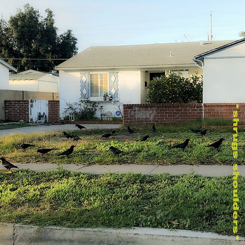
- *Shrugs Shoulders* by Puzzle -
- She's A Big Boy by Mcbaise -
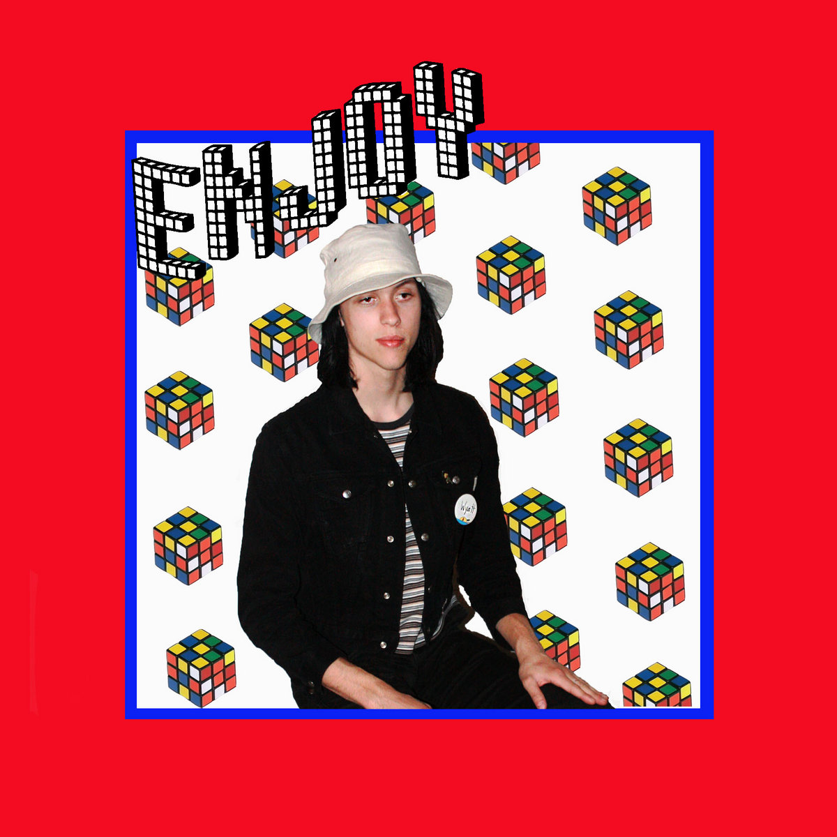
- Another Word For Joy by Enjoy-
Edited By Limor on 2/1/2022 at 3:02 AM.
Arcaneapathy
Level 70
The Artistic
Joined: 11/13/2018
Threads: 34
Posts: 472
Posted: 1/26/2022 at 11:30 PM
Post #643
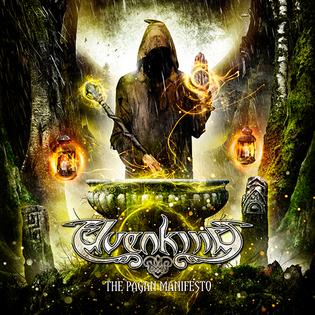
Elvenking: The Pagan Manifesto
Critique:
This is a very nice, well put-together design! I'm not usually a fan of that G3, but you made it work. I suggest some minor color changes: G1 and C3 are rather similar, and overall the design could benefit from lighter colors. M3 gets lost in the design, so I'd change it to something that stands out a bit more.
Redesign : Original
Edited By Arcaneapathy on 1/26/2022 at 11:30 PM.
Limor
Level 72
The Kind-Hearted
Joined: 7/5/2016
Threads: 293
Posts: 19,132
Posted: 2/1/2022 at 4:11 PM
Post #644
One more hour to get entries in if you want to enter!
Limor
Level 72
The Kind-Hearted
Joined: 7/5/2016
Threads: 293
Posts: 19,132
Posted: 2/1/2022 at 6:11 PM
Post #645
TOP 3
MusicChallenge (PLEASE BE SURE TO READ EVERYTHING)
Look whos on time today! I got today off so am able to (for once) get these challenge and winners out on time haha. Now I hope you all truly enjoyed this challenge and are looking forward to our next challenge - which will be a throwback (hopfully) to y'alls childhood!
(Remember if you are chosen, you need to claim your prize before the next deadline otherwise you will forfeit it.)
TOP CRITIQUER IS: Sven
@Sven- Please send me a CoD for 20k, you had a very good critique this time around, good job!
1st PLACE~
Sven's Design:
evil twin by Isaac Dunbar
I love the different hues of blues in this design. They all compliment each other and don't blend too much - enough contrast to make the design pleasant. I really like the use of putting the darker colors in the front and the lighter colors in the back. It was a good choice that helps add some depth to the design and I think you really made the tail work out despite it being a somewhat difficult trait to work with at time. Great job and for a prize choose from these (1) (2) (3) (4) stables and pick a pair to get a baby from and send a CoD for 20k! In addition you may also look in Celticnuru's GROUP stable and pick a pet from there if you would like to forgo a pet from me.
2nd PLACE~
Arcane'sDesign:
The Pagan Manifesto by Elvenking
That album cover looks like something straight out of lord of the wings - what a fun choice. Now onto your design! I love how wild and untamed it looks - I think it really captures that energy and vibe from the album cover. Yeti Mane was a great choice here - it really pushed the rugged wilderness feel that i'm personally getting from the cover. You color choices are also spot on and I love the small bright orange highlights that really help pull the design together. Great job this challenge and send me a CoD for 5k - keep up the great work!
3rd PLACE~
Hiraeth's Design:
The Path Home (Rewind Version) by Aviators
This design looks ethereal and magical - which is exactly the feel I get from the album cover. I think the ryori was a great choice - what with them being the 'mysterious' species. I love the use of galaxy in this design, it adds those extra bright flairs of color without being overpowering and ruining the nice dark shadowy vibe. This is a very successful design and i'm quite a fan personally. Great job this challenge and send me a CoD for 5k - keep up the great work!
Mystery prize winner will be DMed shortly.
Limor
Level 72
The Kind-Hearted
Joined: 7/5/2016
Threads: 293
Posts: 19,132
Posted: 2/1/2022 at 6:33 PM
Post #646
"Littlest Pet Shop" Challenge
Recently while cleaning my room I came across all my old littlest pet shop toys. I figured wow with such a huge variety this will make a perfect challenge. After further diving into the website I was able to truly see how big the collections are and decided this truly is a good challenge for this week. I hope you all enjoy the blast back to childhood and are able to find inspiration in order to create great designs this challenge!
If you were curious we almost did the beanie baby challenge this week and it will likely pop up sometime soon.
View all LPS here, here, here, and here.
Those who have opted out:
~Requirements~
1.)Your design must be based on a Littlest Pet Shop Character.
2.) You must include the name of the LPS if it has one.
3.) You must include a reference photo.
4.) With in your design post, you must ping not only myself but the designer that posted directly before you only. Reason being, you must create a paragraph (3 to 4 sentences long) giving them friendly feedback and or suggestion on improvement on the design and or designs currently present at that time. Please include a copy of their design you are speaking about, along with a design of your own referencing the suggestions you made so they can see visibly what you are trying to say. (The only except is the first designer to post.) 4.) Designers, if someone critiques/comments on your design you must make an attempt to make the changes the critiquer is suggesting. It is through another's opinion/vision you can see what you haven't/couldn't see before and in so doing improve on what is already done. It is a way for you to learn how to take riskses and test yourself. When you have done so, place your altered piece next to the original so we can see the changes you made in comparison. (DO NOT COPY AND PASTE their direct suggested image and take it as your own. That will not help you improve in the slightest, but will be seen as a form of cheating/theft.)
~Rules/Guidelines~
1.) All core group rules are in play!
2.) Don't be afraid to ask for help, feedback and or anything. We are here for you!
~Example~
#1436 (for the love of god I can't find this one on their site but I own it and found its number online)
Edited By Limor on 2/1/2022 at 7:13 PM.
Hiraeth
Level 75
Hand of Destiny
Joined: 7/14/2015
Threads: 187
Posts: 2,685
Posted: 2/1/2022 at 6:47 PM
Post #647
omg lim. kicking me in the elementary school parts lol. i had so many of these
Revol
Level 75
Wondrous Warlock
Joined: 4/4/2019
Threads: 42
Posts: 3,011
Posted: 2/1/2022 at 10:13 PM
Post #648
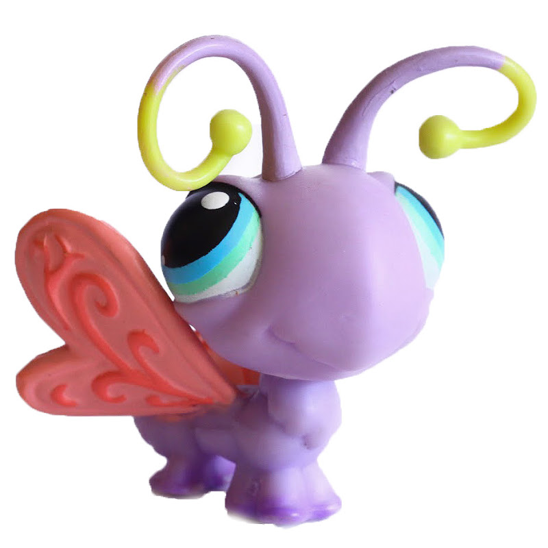
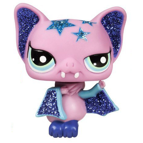
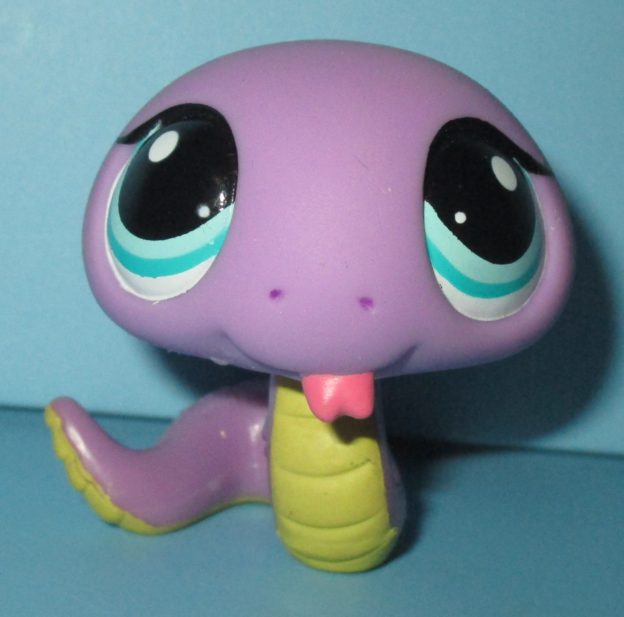
I have decided, of course, to only do the littlest pet shop I had. Because memories :)
#093
(original)
(edited)
#2479
#2142
#1828
#1233
(more to come!!)
Edited By Given on 2/3/2022 at 12:22 PM.
Arcaneapathy
Level 70
The Artistic
Joined: 11/13/2018
Threads: 34
Posts: 472
Posted: 2/2/2022 at 11:09 AM
Post #649
I was so excited to see this challenge as I was an avid collector. I kind of regret giving them all away... Here's my favorite that I owned though! I always made him the king of all the other cats. He'd get to sit in the little green basket on the paw-powered cruiser to overlook his kingdom as he rode. So without further ado, I present...
Pink Persian #460
Edited:
--
Critique:
Your designs are all wonderful! The only one that stands out to me as even needing critique is the first one. The colors are significantly lighter in your design, so I darkened most of them. The spectral wings, while not quite being true to the LPS, fit your design well, so I left them and added a G2 instead.
Redesign : Original
Edited By Arcaneapathy on 2/4/2022 at 11:12 AM.
Limor
Level 72
The Kind-Hearted
Joined: 7/5/2016
Threads: 293
Posts: 19,132
Posted: 2/3/2022 at 11:59 PM
Post #650
-- Critique --
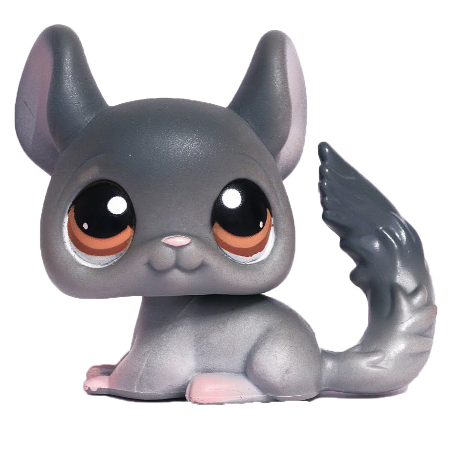
In your design I would make the green a tad more teal or blue. In the photo the color looks a little more blue to me but this could also be put down to my screen resolution showing colors weird lol. I like the traits you chose and I think there show the tiger stripe designs on your chosen pick quite well. I would also suggest lightening the colors a bit, yours looks more saturated/colored then the somewhat pale design you chose. Overall I like your design and I think this is pretty good other then maybe needing a few VERY slight color tweaks.
Chinchilla #144
Go to Page:
1, 2, 3... 64, 65, 66... 68, 69, 70
Confirm Action
Are you sure you wish to delete this post?
Confirm Action
Are you sure you wish to restore this post?
Confirm Action
Are you sure you wish to report this post?
Go to Top
This Page loaded in 0.016 seconds.
Terms of Service | Privacy Policy | Contact Us | Credits | Job Opportunities