Forum Index > Groups, Guilds, Clubs, and Services > ~*~ DESIGNERS' CHALLENGE UNIVERSITY...
Page 31
1, 2, 3... 30, 31, 32... 68, 69, 70
Go to Page:
Author
Thread Post
Limor
Level 72
The Kind-Hearted
Joined: 7/5/2016
Threads: 293
Posts: 19,132
Posted: 3/18/2021 at 5:57 PM
Post #301
https://www.sylestia.com/view/pets/?petid=6244791
Saroyan
Level 70
Trickster
Joined: 3/17/2020
Threads: 5
Posts: 249
Posted: 3/19/2021 at 9:10 AM
Post #302
~~ Royal Tea ~~
~~ Forever Young ~~
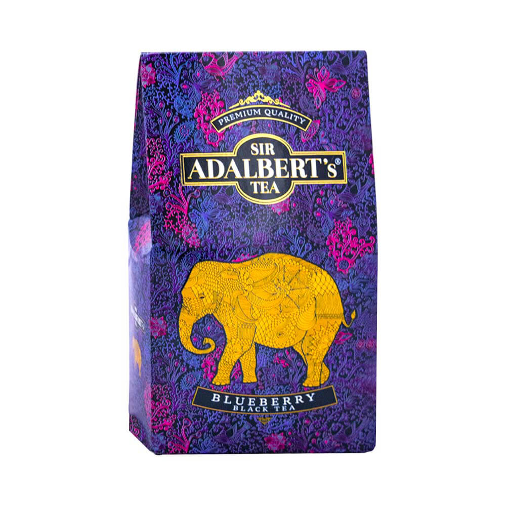
~~ Sir Adalbert's Blueberry Black Tea ~~
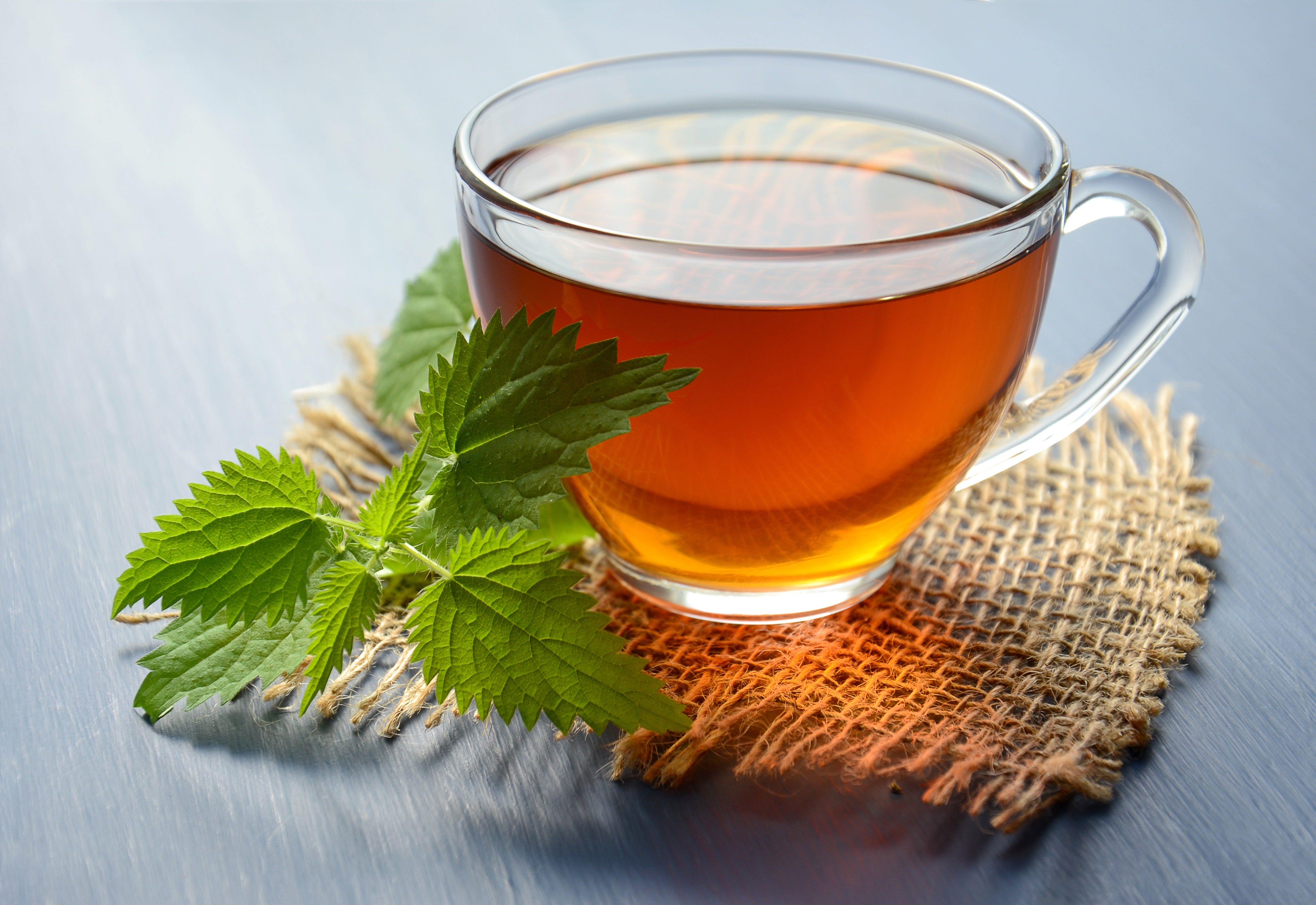
~~ Green Tea with Honey and Plum ~~
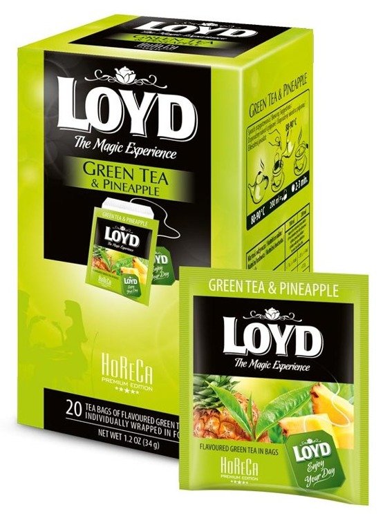
~~ Loyd's Green Tea with Pineapple ~~
Critique:
I really like your green tea design. It's really delicate and fits the chosen tea flavor perfectly. Genes blend very nice and I adore your trait choices. But, in my opinion, the colors are a little bland and it would be great for the yellows to pop out a little more. So I just made the yellows a bit more saturated with a tinge of orange. Also, I added color to M2. Overall, the design is great and only the colors needed a bit of tweaking.
Before and After:
Edited By Saroyan on 3/20/2021 at 5:13 AM.
Frostfire
Level 69
Frosty Hands
Joined: 1/2/2021
Threads: 5
Posts: 794
Posted: 3/19/2021 at 9:18 AM
Post #303
Critique:
I really, really love the colors you chose for green tea! The yellow and brown blend together to give it such a warm and lively feeling, like sunlight through a forest canopy! And using your M3 to represent steam was definitely a stroke of genius!
Now, I felt that maybe the colors blended a little TOO well, so I changed them up a bit to create some contrast. The M2 color you chose didn't really fit with the whole aesthetic, so I would change it to a dark green to compliment your awesome design
I'm so sorry but I have to opt out again, I'm absolutely swamped with school work.
Limor
Level 72
The Kind-Hearted
Joined: 7/5/2016
Threads: 293
Posts: 19,132
Posted: 3/19/2021 at 11:10 PM
Post #305
Do you need to be put on leave until your ready?
Limor
Level 72
The Kind-Hearted
Joined: 7/5/2016
Threads: 293
Posts: 19,132
Posted: 3/22/2021 at 9:25 AM
Post #306
TOP 3
"Tea Time" Challenge (PLEASE BE SURE TO READ EVERYTHING)
Cat had a medical emergency so this is once again late, we still need staff applications so check the post here! Along with this I love all the entries we've had so far as well as all the improvements i've been seeing with help of critiques. Your designs are all making leaps and bounds forward and I can't wait to see what else is to come.
(Remember if you are chosen, you need to claim your prize before the next deadline otherwise you will forfeit it.)
TOP CRITIQUER IS: Shimmer
@Shimmer- Please send me a CoD for 20k, you had a very good critique this time around, good job!
1st PLACE~
Noha'sDesign:
Hibiscus Splash
I love both the critiqued and original design. The second I saw this design the colors caught me - they have such nice soft pastels that are so pretty. They have such a nice pale complimentary colors that just look absolutely amazing. Along with your colors your trait choices are *amazing*. They perfectly replicate your chosen tea box. Great great job and for a prize choose from these (1) (2) (3) (4) stables and pick a pair to get a baby from and send a CoD for 20k! In addition you may also look in Celticnuru's GROUP stable and pick a pet from there if you would like to forgo a pet from me.
2nd PLACE~
Frost's Design:
Gold-TIpped Porcelain Tea Cup
I gotta give you props for taking the jump on making a teacup here, it stuck out to me! Along with your reference being different then anything else this design is spot on! The mixture of royal blues and golds are good complimentary colors and when done right (as you did in this design!) really shine through. Great job, Send a CoD for 15k please and please keep up the good work, I look forward to seeing what you make in the future!
3rd PLACE~
Luna'sDesign:
Lemon Grass Tea
I gotta say, great job on both your before and after. Now I may be biased but I prefer that after! Those deep rich ambers really pull the design through and I gotta say you made the most changes out of everyone with a critiqued design and it's great that your able to take others help and really make your designs shine with that! Great job on this design and send a CoD for 5k!
Mystery prize winner will be DMed shortly.
Limor
Level 72
The Kind-Hearted
Joined: 7/5/2016
Threads: 293
Posts: 19,132
Posted: 3/22/2021 at 9:40 AM
Post #307
"Book Covers" Challenge
Back again with another late challenge! In this challenge we'll be taking a look at Book Covers and using all those literary things to inspire us in this weeks design challenge. We'll need y'all to take out your reading caps and get those books out (perhaps you can find a book from your childhood even!) and I personally can't wait to see what y'all pull out for this challenge!
Those who have opted out:
~Requirements~
1.)Your design must be based on a book cover.
2.) You must have a reference
3.) Please include the book name and author.
4.) With in your design post, you must ping not only myself but the designer that posted directly before you only. Reason being, you must create a paragraph (3 to 4 sentences long) giving them friendly feedback and or suggestion on improvement on the design and or designs currently present at that time. Please include a copy of their design you are speaking about, along with a design of your own referencing the suggestions you made so they can see visibly what you are trying to say. (The only except is the first designer to post.) 4.) Designers, if someone critiques/comments on your design you must make an attempt to make the changes the critiquer is suggesting. It is through another's opinion/vision you can see what you haven't/couldn't see before and in so doing improve on what is already done. It is a way for you to learn how to take riskses and test yourself. When you have done so, place your altered piece next to the original so we can see the changes you made in comparison. (DO NOT COPY AND PASTE their direct suggested image and take it as your own. That will not help you improve in the slightest, but will be seen as a form of cheating/theft.)
~Rules/Guidelines~
1.) All core group rules are in play!
2.) Don't be afraid to ask for help, feedback and or anything. We are here for you!
~Example~
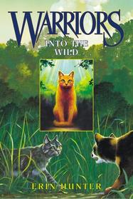
Into the Wild - Erin Hunter
Edited By Limor on 3/22/2021 at 9:44 AM.
Lunadove
Level 70
The Sweet Tooth
Joined: 9/7/2020
Threads: 174
Posts: 1,865
Posted: 3/22/2021 at 9:48 AM
Post #308
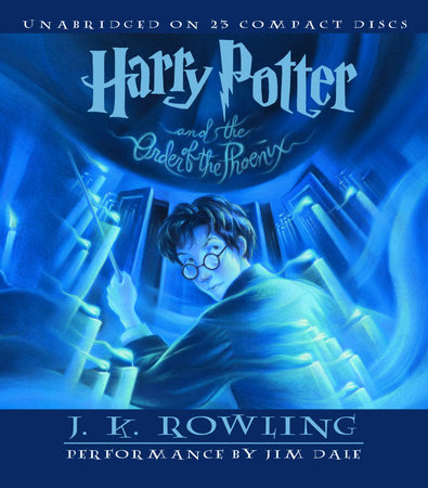
Harry Potter and the Order of the Phoenix
J.K. Rowling
Original:
Critique:
Taking Critique into account:
~~~~~~~~~~~~~~~~~~~~~~~~~~~~~~~~~~~~~~~~~~~~~~~~~~~~~~~~~
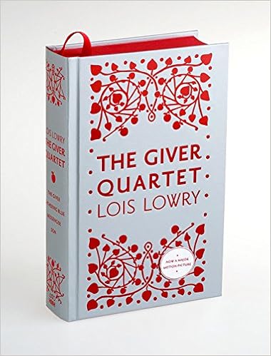
The Giver Quartet
Lois Lowry
please ping when you return, until then due to absences you have been removed from the group to clear up the ping list!
Dragongem23
Level 63
The Tender
Joined: 7/19/2017
Threads: 254
Posts: 25,229
Posted: 3/22/2021 at 11:15 AM
Post #310
Going to try and get at least one done cause this week is PACKED
EDIT: My critique cause I'm stupid and forgot it
@Lunadove
I love how you somewhat made a almost monochromatic blue design work but i did end up changing a few parts. I darkened the C1 and brighten some of the other blues to make them stand out more. I also tried to blend the Ribbons more into the wispy mane of the Ryori but still have it be different enough...if you get what I mean. The wispy mane itself i made a tad less saturated, just cause i picture candle smoke to be dimmer than the bright cyan you picked. And my version of that cover is old and faded so I'm used to the bright blues being more dimmed and dulled.
1970's The Lion, The Witch, And The Wardrobe
(my version of the book is so faded since it's a old second hand school libarary book)
I ended up mainly using the border and the coats, and not the actual middle part itself for the first one so i made two
V2
V2
Edited By Dragongem23 on 4/20/2021 at 7:39 PM.
Go to Page:
1, 2, 3... 30, 31, 32... 68, 69, 70
Confirm Action
Are you sure you wish to delete this post?
Confirm Action
Are you sure you wish to restore this post?
Confirm Action
Are you sure you wish to report this post?
Go to Top
This Page loaded in 0.016 seconds.
Terms of Service | Privacy Policy | Contact Us | Credits | Job Opportunities