Forum Index > Pet Sharing and Design Discussion > Dragongem23's Designs
Page 15
1, 2, 3... 13, 14, 15
Go to Page:
Author
Thread Post
Dragongem23
Level 63
The Tender
Joined: 7/19/2017
Threads: 254
Posts: 25,229
Posted: 3/7/2021 at 8:05 PM
Post #141
D.C.U Week of 3/7/2021
@Limor
I honestly love all the dark purple shades you've included with you're hellbore design but i feel like there's green missing. Even though it's there. I also suggest darkening the very light pink G1 to something a tad darker to help fight that blue that Iridescence brings into the design.I ended up changing some of the yellow to be a tad more green and changed the mask into a very light green instead of pink to help tie in more greens
@Lunashadow
I love the idea you were going for but i do feel like it was really purple and really saturated. I personally would de-saturate and lighten alot of the colors to bring in more a icy feel.I also suggest possibly leaning more towards the green/cyan/blue instead of the darker purply blue that you were using.I also suggest using a lighter color for the icy crown and the fairy adornments just to help them stand out and not bleed/blend int other design as much as they used to.I will say the iridescence really helps bring in this aura vibe to the edge of the wings and the shoulder so good job with that!
~*~
A Poppy's Pride Edited Version Blue Buddy Budgie Edited Version Melony Monarch Edited Version
Edited By Dragongem23 on 3/7/2021 at 9:46 PM.
Dragongem23
Level 63
The Tender
Joined: 7/19/2017
Threads: 254
Posts: 25,229
Posted: 4/20/2021 at 7:39 PM
Post #142
WEEK OF 3/22/2021
@Lunadove
I love how you somewhat made a almost monochromatic blue design work but i did end up changing a few parts. I darkened the C1 and brighten some of the other blues to make them stand out more. I also tried to blend the Ribbons more into the wispy mane of the Ryori but still have it be different enough...if you get what I mean. The wispy mane itself i made a tad less saturated, just cause i picture candle smoke to be dimmer than the bright cyan you picked. And my version of that cover is old and faded so I'm used to the bright blues being more dimmed and dulled.
1970's The Lion, The Witch, And The Wardrobe
(my version of the book is so faded since it's a old second hand school libarary book)
I ended up mainly using the border and the coats, and not the actual middle part itself for the first one so i made two
V2
V2
Dragongem23
Level 63
The Tender
Joined: 7/19/2017
Threads: 254
Posts: 25,229
Posted: 4/20/2021 at 7:41 PM
Post #143
D.C.U WEEK OF 4/13/2021
Critique for Noha
So first off the green's you chose are LOVELY. I did decide to change the grey to be more blue cause it made more sense for it to match the lake instead of the mountain's in the background. And i also brightened the yellow/tan color from the other leaves because of the way the light hits them making them brighter in the image. I can't express how spot on the green's are though and the traits feel perfect!
Critique For Zolnixi
First off , your design is really saturated a bright whereas the picture isn't so i dulled down the colors a bit but left the pink bright. I also played around with the browns and creams to make a more sandy feel. I do think the biggest thing that could be fixed is the shades of blue. There's so many different shades in the water and I feel like it's a good idea to take those and incorporate them into the design. So I tried that
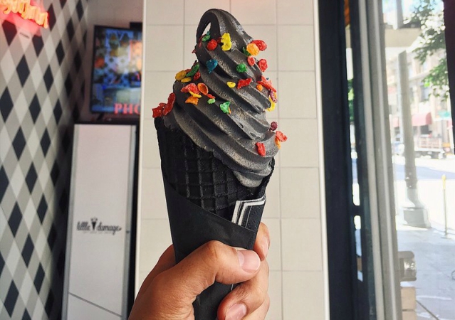
Charcoal Ice Cream
I just really want to try this flavor SO BAD which is weird
Watch me struggle to add in the rainbow sprinkle/fruity pebbles
Dragongem23
Level 63
The Tender
Joined: 7/19/2017
Threads: 254
Posts: 25,229
Posted: 4/20/2021 at 7:42 PM
Post #144
D.C.U WEEK OF 4/20/2021
@Zolnixi
Honestly i think the color choice is great except for how saturated they are. So I went and made them more pastel. I did however keep the bright blue because it makes the eyes and the mutations pop which I really liked. The yellow I went and made more orangey since that really bright shade of yellow feels weird with the others and made the overall design feel really clowny.
Party Time Puff -- 100th Challenge Prompt --
"Gemstone" Mandatory Challenge Past Challenge
Wanted to take a stab at designing Ametrine Again
Go to Page:
1, 2, 3... 13, 14, 15
Confirm Action
Are you sure you wish to delete this post?
Confirm Action
Are you sure you wish to restore this post?
Confirm Action
Are you sure you wish to report this post?
Go to Top
This Page loaded in 0.010 seconds.
Terms of Service | Privacy Policy | Contact Us | Credits | Job Opportunities